A table is a great way to show you systematic data in a short amount of time if you're going to read a topic. It helps to understand the topic easily and understand the content easily.
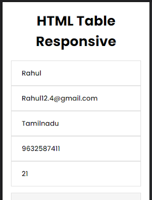
Add HTML responsive Table to your Blogger & WordPress website. But, not all HTML Tables are mobile responsive, sometime the table will not fit the page and be shown unformatted and just we need to use a CSS - media screen to set the value as mobile-friendly especially when you insert multiple rows and columns.
$ads={1}
Now we use the Meta tag viewport method for mobile phones, computer screens, and tablet browsers on those devices scaled down the entire web page to fit the screen.
Most of the important HTML tables tag are using <table>,<thead>,<tbody>,<th>,<tr>,<td> and all tag are have the closing tags you need more details means .I already create article about the tables and tags.
And I found some Html responsive table Generator to customize easy and edit click here
How to Add Html responsive table in Blogger
Open the blogger and login -> dashboard
Open New Post left side corner will see the button composer HTML to HTML view.
Now ,Just copy the above HTML Code and change the values
Now paste the code on your perfect place in the article and submit.
Now the html table responsive added to your blogger website.
CSS:
body
{
margin:0;
padding:20px;
font-family: 'Poppins', sans-serif;
}
*
{
box-sizing:border-box;
}
h1
{
text-align:center;
}
.table
{
width:100%;
border-collapse:collapse;
}
.table td,
.table th
{
padding:1rem 1.5rem;
border:1px solid #ddd;
text-align:left;
font-weight:500;
}
.table th
{
background-color: #1AA7EC;
color:#fff;
}
.table tbody tr:nth-child(even)
{
background-color:#f5f5f5;
}
@media(max-width:500px){
 .table thead
{
  display:none;
}
.table,
.table tbody,
.table tr,
.table td
{
display:block;
width:100%;
}
.table tr
{
margin-bottom:15px;
}
}
HTML CODE:
<h1>HTML Table Responsive</h1>
<table class="table">
  <thead>
    <tr>
      <th>Name</th>
      <th>Email</th>
      <th>Location</th>
	  <th>MobileNo</th>
      <th>Age</th>
    </tr>
  </thead>
  <tbody>
    <tr>
      <td data-label="Name">Rahul</td>
      <td data-label="Email">Rahul12.4@gmail.com</td>
      <td data-label="Location">Tamilnadu</td>
	  <td data-label="MobileNo">9632587411</td>
      <td data-label="Age">21</td>
    </tr>
    <tr>
      <td data-label="Name">Vishnu Reddy</td>
      <td data-label="Email">V.reddy93@gmail.com</td>
      <td data-label="Location">Andhra Pradesh</td>
	  <td data-label="MobileNo">9874563211</td>
      <td data-label="Age">27</td>
    </tr>
    <tr>
      <td data-label="Name">Priya dhurai</td>
      <td data-label="Email">priyad.143@gmail.com</td>
      <td data-label="Location">karnataka</td>
	  <td data-label="MobileNo">9512365478</td>
      <td data-label="Age">28</td>
    </tr>
    <tr>
      <td data-label="Name">vidhiya Menon</td>
      <td data-label="Email">vidhiyamenon.y@gmail.com</td>
      <td data-label="Location">Kerala</td>
	  <td data-label="MobileNo">9873214566</td>
      <td data-label="Age">23</td>
    </tr>
    <tr>
      <td data-label="Name">Mohammed Fahil</td>
      <td data-label="Email">mohfahil97@gmail.com</td>
      <td data-label="Location">Delhi</td>
	  <td data-label="MobileNo">9987456322</td>
      <td data-label="Age">30</td>
    </tr>
  </tbody>
</table>
<table class="table">
  <thead>
    <tr>
      <th>Name</th>
      <th>Email</th>
      <th>Location</th>
	  <th>MobileNo</th>
      <th>Age</th>
    </tr>
  </thead>
  <tbody>
    <tr>
      <td>Rahul</td>
      <td>Rahul12.4@gmail.com</td>
      <td>Tamilnadu</td>
	  <td>9632587411</td>
      <td>21</td>
    </tr>
    <tr>
      <td>Vishnu Reddy</td>
      <td>V.reddy93@gmail.com</td>
      <td>Andhra Pradesh</td>
	  <td>9874563211</td>
      <td>27</td>
    </tr>
    <tr>
      <td>Priya dhurai</td>
      <td>priyad.143@gmail.com</td>
      <td>karnataka</td>
	  <td>9512365478</td>
      <td>28</td>
    </tr>
    <tr>
      <td>vidhiya Menon</td>
      <td>vidhiyamenon.y@gmail.com</td>
      <td>Kerala</td>
	  <td>9873214566</td>
      <td>23</td>
    </tr>
    <tr>
      <td>Mohammed Fahil</td>
      <td>mohammedrahil97@gmail.com</td>
      <td>Delhi</td>
	  <td>9987456322</td>
      <td>30</td>
    </tr>
  </tbody>
</table>
How to Add Html responsive table in WordPress
Creating a WordPress table is easy and there are two ways to do it.
You can create a "table" with rows and columns using "create table".
search for the "Custom HTML" block and insert the above code and publish the blog post.
How to Add Bootstrap table responsive for website
Bootstrap frameworks provide every nice and clean layout for building tables. In Blogger and WordPress are only a few themes that support "bootstrap tables". But you are creating a table for a website bootstrap is the best option to use and bootstrap tables have additional classes that you can use to style the markup and easy to customize the responsive table or using to create bootstrap table generator.
<div class="table-responsive">
<table class="table table-striped table-bordered table-responsive">
  <thead class="bg-primary text-white">
    <tr>
      <th>Name</th>
      <th>Email</th>
      <th>Location</th>
	  <th>MobileNo</th>
      <th>Age</th>
    </tr>
  </thead>
  <tbody>
    <tr>
      <td>Rahul</td>
      <td>Rahul12.4@gmail.com</td>
      <td>Tamilnadu</td>
	  <td>9632587411</td>
      <td>21</td>
    </tr>
    <tr>
      <td>Vishnu Reddy</td>
      <td>V.reddy93@gmail.com</td>
      <td>Andhra Pradesh</td>
	  <td>9874563211</td>
      <td>27</td>
    </tr>
    <tr>
      <td>Priya dhurai</td>
      <td>priyad.143@gmail.com</td>
      <td>karnataka</td>
	  <td>9512365478</td>
      <td>28</td>
    </tr>
    <tr>
      <td>vidhiya Menon</td>
      <td>vidhiyamenon.y@gmail.com</td>
      <td>Kerala</td>
	  <td>9873214566</td>
      <td>23</td>
    </tr>
    <tr>
      <td>Mohammed Fahil</td>
      <td>mohammedrahil97@gmail.com</td>
      <td>Delhi</td>
	  <td>9987456322</td>
      <td>30</td>
    </tr>
  </tbody>
</table>
</div>


