Data Visualize using chart.js library (Tutorial)
Chart.js is a community maintained open-source library (it’s available on GitHub) that helps you easily visualize data using JavaScript.that allows you to draw different types of charts by using the HTML5 canvas element. Since it uses HTML5 canvas , you have to include a polyfill to support older browsers.
Its responsive, have Interactivity features (Mouse over - on click),and also use legend also known as a key. A legend contains a list of the variables appearing in the chart and an example of their appearance. This information allows the data from each variable to be identified in the chart.
It’s similar to Chartist and Google Charts. It supports 8 different chart types (including bars, lines, & pies), and they’re all responsive.
First of we need to add Chart.js to our page so that we can use the library. For this project, I’ve prepared a simple playground with a HTML file with only the essentials.
First of we need to add Chart.js to our page so that we can use the library. For this project, I’ve prepared a simple playground with a HTML file with only the essentials.
<html>
<head>
    <script src="https://cdnjs.cloudflare.com/ajax/libs/Chart.js/2.5.0/Chart.min.js"></script>
    </head>
    <body>
    <canvas id="bar-chart" width="300" height="100">
      <script>

            new Chart(document.getElementById("bar-chart"), {
    type: 'bar',
    data: {
      labels: ["japan", "china", "singapore", "Thailand", "australia"],
      datasets: [
        {
          label: "Corona virus affected",
          backgroundColor: ["#3e95cd", "#8e5ea2","#3cba9f","#e8c3b9","#c45850"],
          data: [310,129,210,88,280]
        }
      ]
    },
    options: {
      legend: { display:true },
      title: {
        display: true,
        text: 'Corona virus affected in 2020'
      }
    }
});

      </script>
        </canvas>
</body>
</html>
<html>
<head>
    <script src="https://cdnjs.cloudflare.com/ajax/libs/Chart.js/2.5.0/Chart.min.js"></script>
    </head>
    <body>
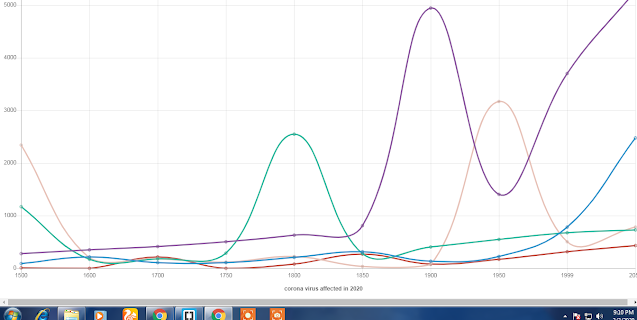
<canvas id="line-chart" width="800" height="450">
                  <script>

new Chart(document.getElementById("line-chart"), {
  type: 'line',
  data: {
    labels: [1500,1600,1700,1750,1800,1850,1900,1950,1999,2050],
    datasets: [{
        data: [86,214,106,106,207,311,133,221,783,2478],
        label: "china",
        borderColor: "#3e95cd",
        fill: false
      }, {
        data: [282,350,411,502,635,809,4947,1402,3700,5267],
        label: "japan",
        borderColor: "#8e5ea2",
        fill: false
      }, {
        data: [1168,170,178,290,2553,276,408,547,675,734],
        label: "thailand",
        borderColor: "#3cba9f",
        fill: false
      }, {
        data: [2340,200,180,116,224,38,74,3167,508,784],
        label: " America",
        borderColor: "#e8c3b9",
        fill: false
      }, {
        data: [6,3,212,2,77,266,82,172,312,433],
        label: "unitedkingdom",
        borderColor: "#c45850",
        fill: false
      }
    ]
  },
  options: {
    title: {
      display: true,
      text: 'corona virus affected'
    }
  }
});
</script>
        </canvas>
</body>
</html>
<html>
<head>
    <script src="https://cdnjs.cloudflare.com/ajax/libs/Chart.js/2.5.0/Chart.min.js"></script>
    </head>
    <body>


<canvas id="pie-chart" width="800" height="450">
            <script>
new Chart(document.getElementById("pie-chart"), {
    type: 'pie',
    data: {
      labels: ["japan", "china", "Thailand", "America", "india"],
      datasets: [{
        label: "corona virus affected area",
        backgroundColor: ["#3e95cd", "#8e5ea2","#3cba9f","#e8c3b9","#c45850"],
        data: [478,2267,734,784,433]
      }]
    },
    options: {
      title: {
        display: true,
        text: 'corona virus affected in 2020'
      }
    }
});
            </script>
        </canvas>
        </body>
</html>
<html>
<head>
    <script src="https://cdnjs.cloudflare.com/ajax/libs/Chart.js/2.5.0/Chart.min.js"></script>
    </head>
    <body>

<canvas id="doughnut-chart" width="800" height="450"></canvas>
        <script>
new Chart(document.getElementById("doughnut-chart"), {
    type: 'doughnut',
    data: {
      labels: ["japan", "china", "Thailand", "America", "india"],
      datasets: [
        {
          label: "corona virus affected",
          backgroundColor: ["#3e95cd", "#8e5ea2","#3cba9f","#e8c3b9","#c45850"],
          data: [478,1267,734,784,433]
        }
      ]
    },
    options: {
      title: {
        display: true,
        text: 'corona virus affected in 2020'
      }
    }
});
</script>
    </body>
</html>


